Nike × Fathom Information Design
Concept, Creative Direction, Design with Fathom
What does a year of movement look like?
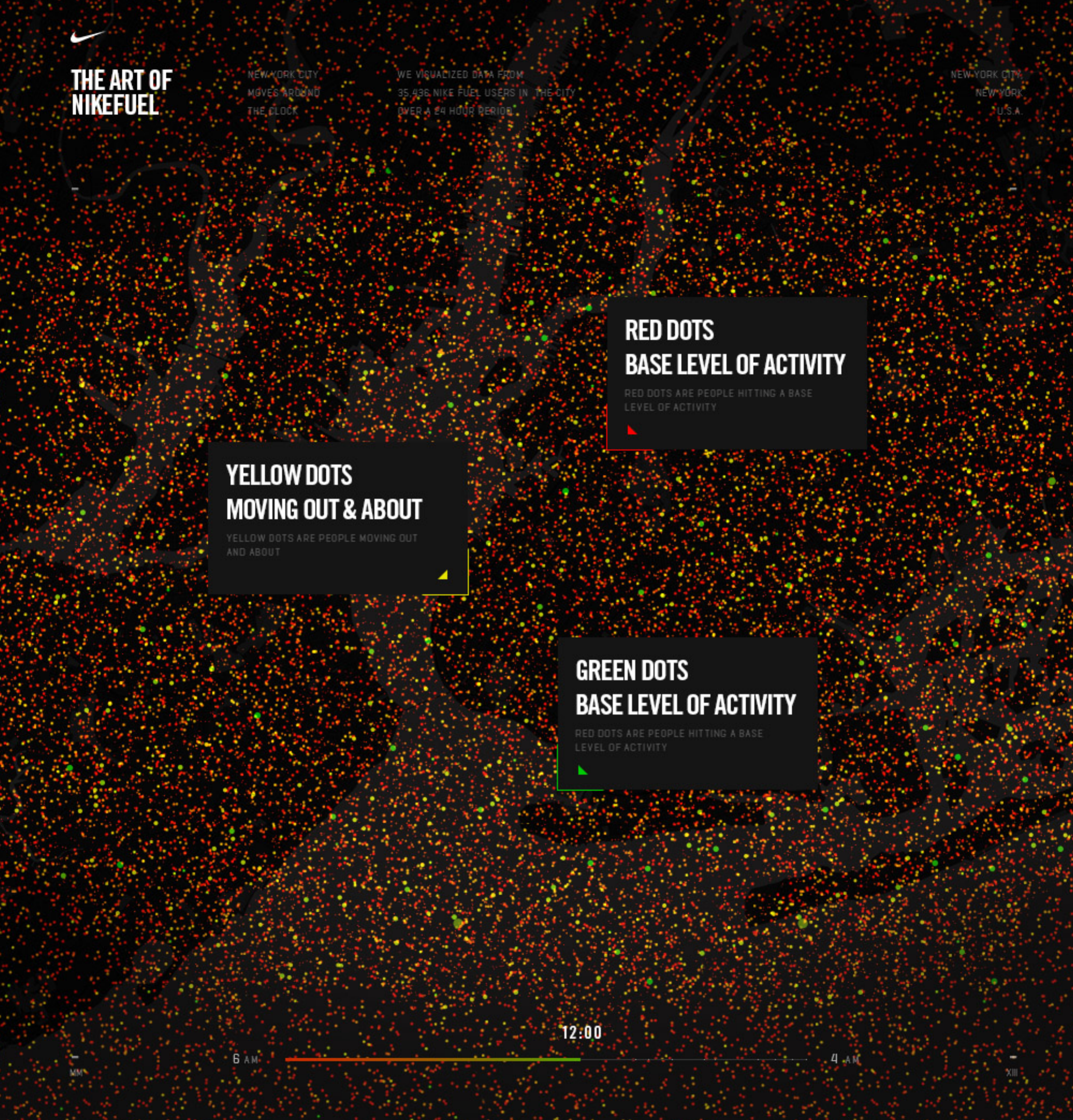
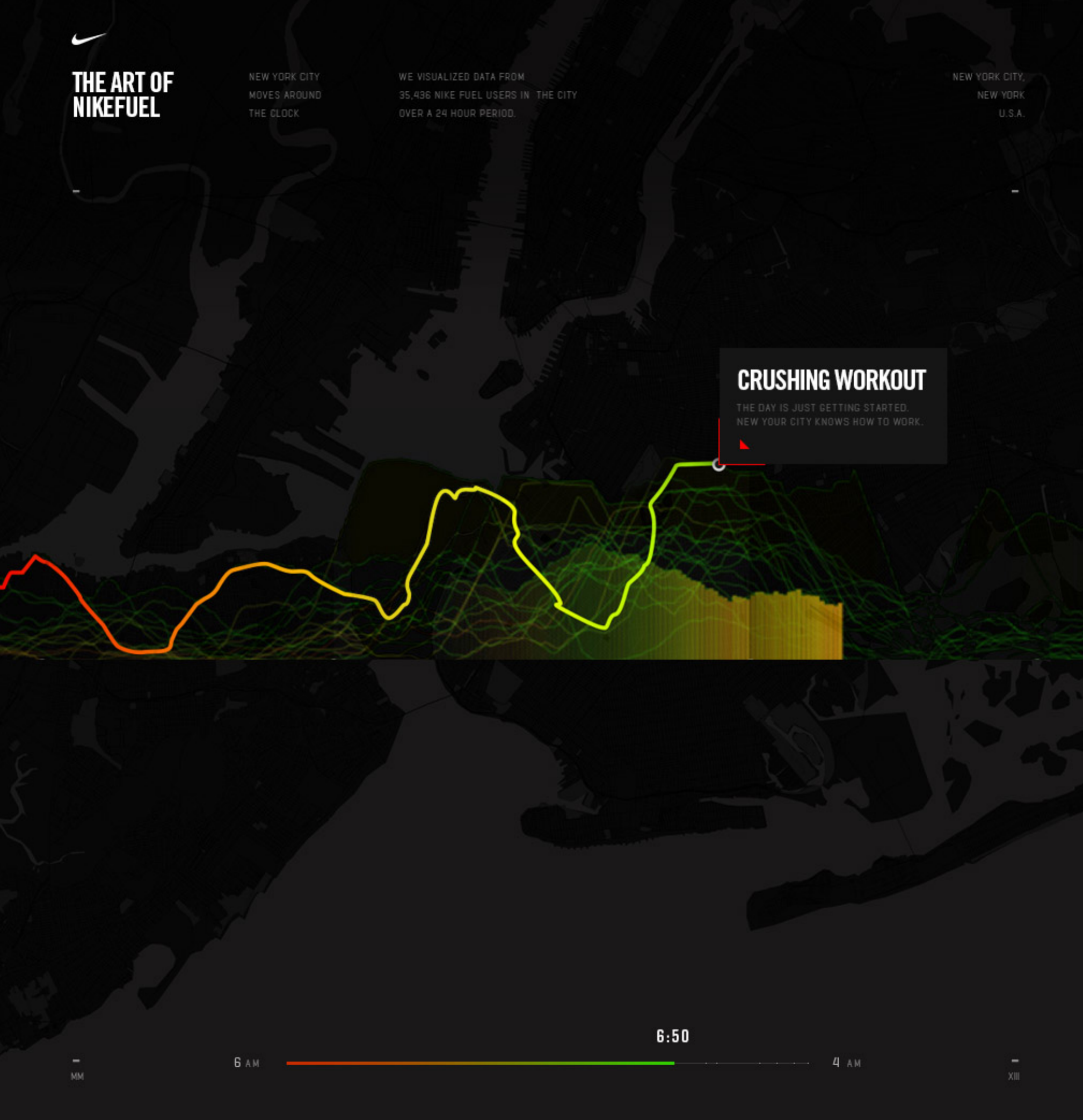
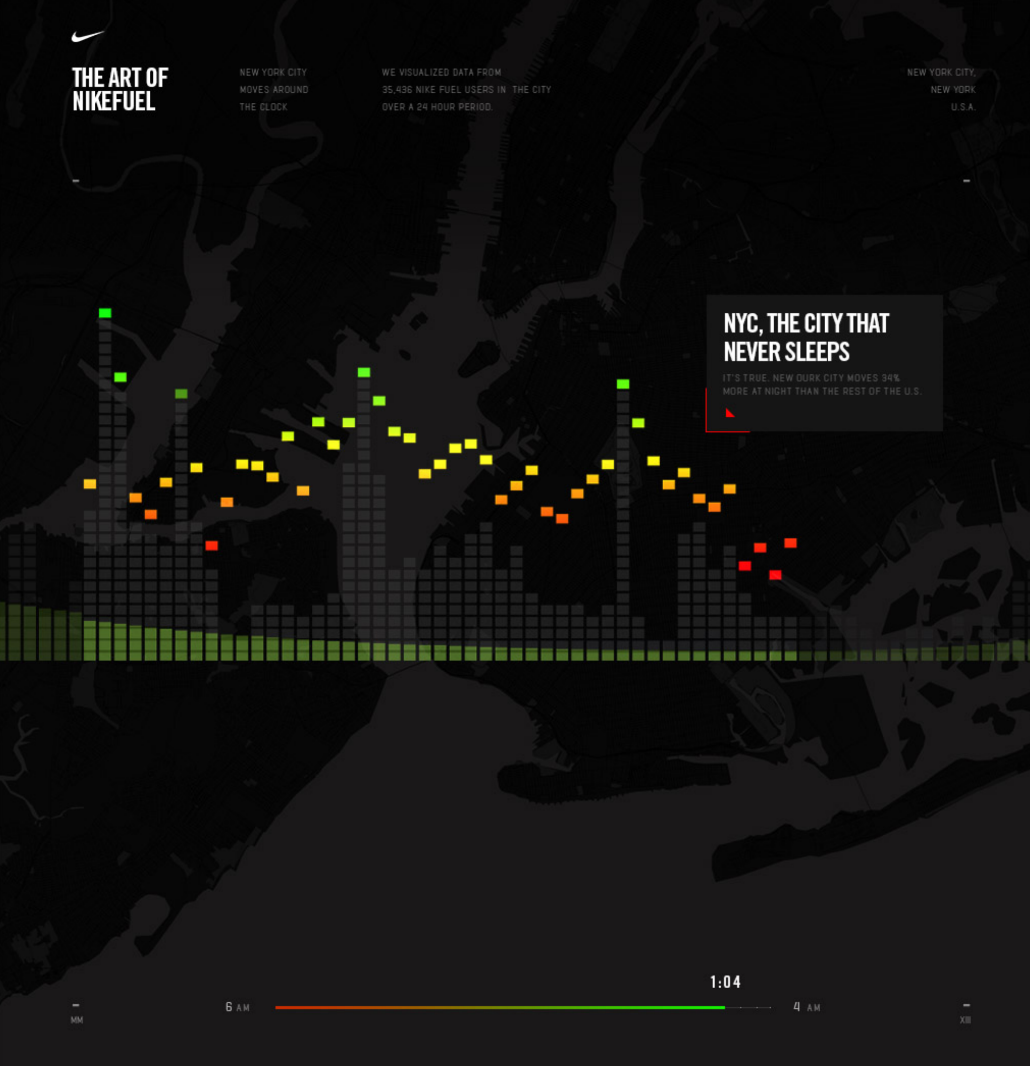
Year in NikeFuel turned a Nike+ member’s activity into a personal portrait. Working with Fathom Information Design, I helped guide the project from an experimental data visualization into a Nike experience that could be generated for members around the world.
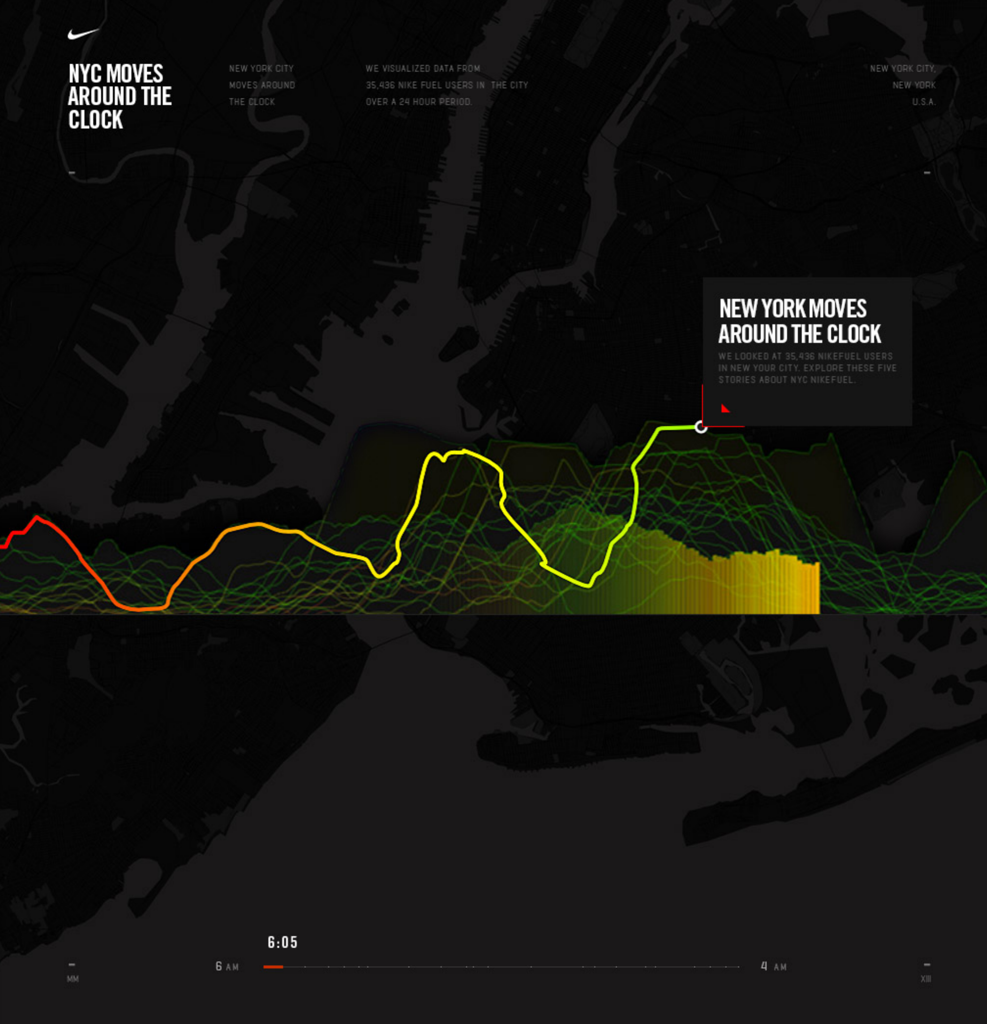
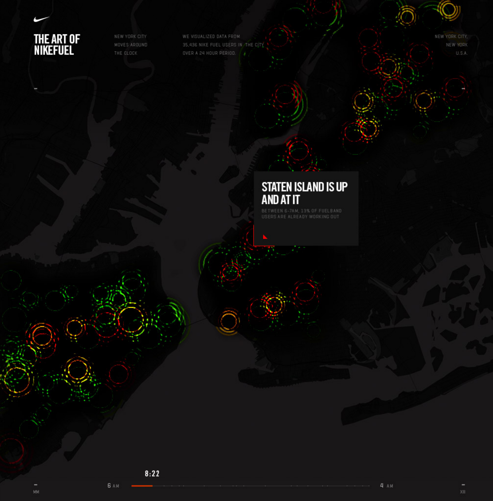
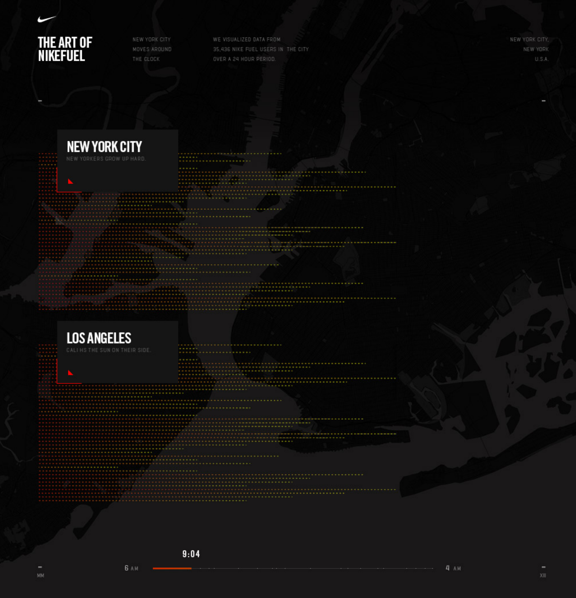
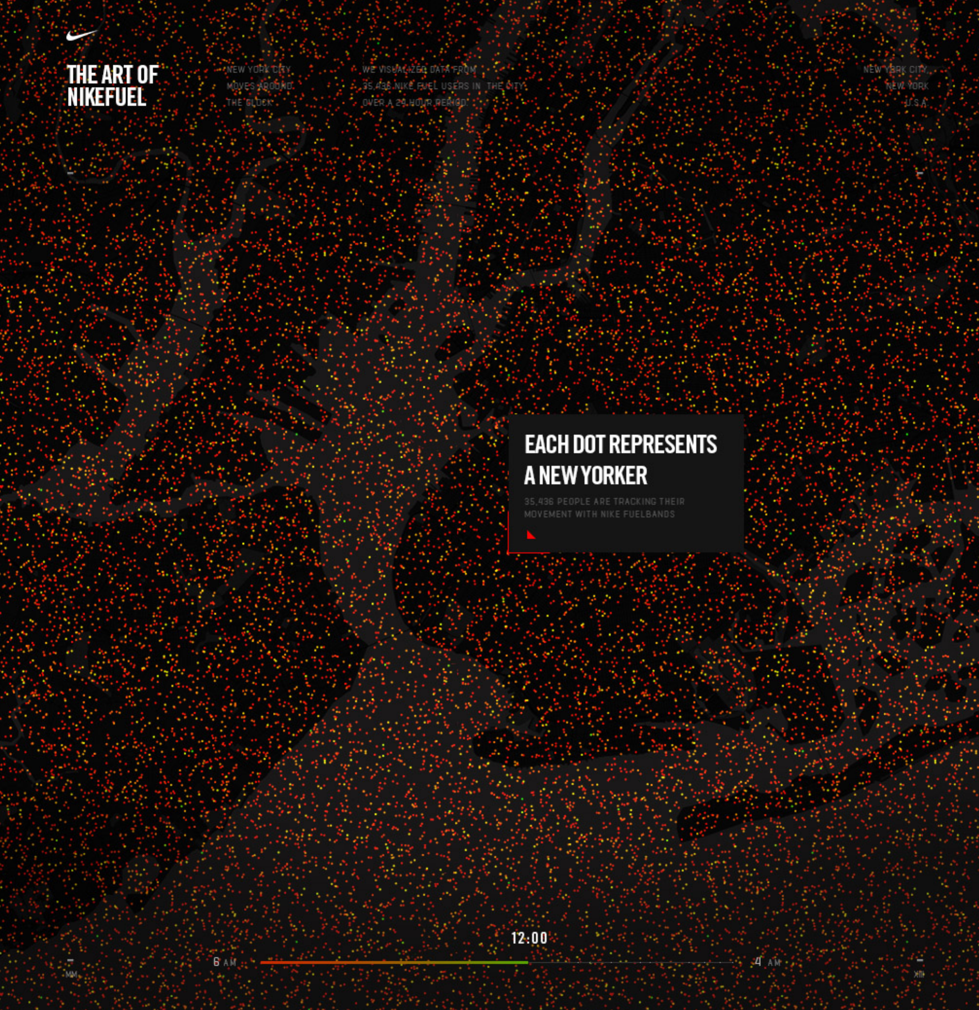
Fathom’s early studies revealed something compelling: daily movement data held traces of routine, effort, and change that a single score could never show. Our challenge was to bring that insight to the Nike+ community through a design that felt both individual and unmistakably Nike.
The resulting poster layered a year of daily activity into a vivid, fire-like image. Patterns became visible at a glance; charts beneath the portrait gave members a closer reading of their movement. Each person could view, download, print, and share their own Year in NikeFuel.
The project brought together brand expression, generative design, and technical scale. It gave members a new way to see what they had done—and made their year of movement something they could keep.